PCA on yield curve#
Consider a yield curve given by \(Y(t, X) = F(t, X, X+\tau)\), where \(\tau\) is fixed to be 0.25, and \(F(t, X, X+\tau)\) is the forward rate for period \((X, X+\tau)\) observed at \(t\)
The yield curve at time \(t\) is given by \(\{Y(t, X_1) \dots Y(t, X_N)\}\) for some fixed tenors \((X_1 \dots X_N)\)
We are interested in how the yield curve \(Y(t)\) moves w.r.t. time
Swap Rate curve#
We have an \(n \times p\) data matrix \(X\)
i.e. we have swap data for \(p\) maturies \(T_1 = 1Y, T_2 = 2Y, \dots T_p = 30Y\)
And with each maturity \(T_j\), we have a time series \(\{X_t\}^{T_j}\) of \(n\) observations
We first compute the daily changes for each maturity \(T_j\)
We want to standardize each time series, by subtracting the sample mean and SD of each column (over \(n\) days), resulting in the standardized matrix \(\hat{X}\)
Where j-th column of \(\hat{X}\) is the differenced time series of maturity \(T_j\), that has zero mean and unit variance. Now we do PCA on \(\hat{X}\), and obtain a \(p \times p\) PC matrix, each column being \(PC_1, \dots PC_p\).
Each entry of \(PC_j\) (each row) corresponds to a different maturity
Consider an example of swap rates, given in the book Statistical Models and Methods for Financial Markets on page 47:
We have swap rates data for maturities: 1y, 2y, 3y, 4y, 5y, 7y, 10y, 30y. There is a time series of 1256 days (5 years) for each maturity
We know that PC1 along captures 92.6$, and PC2 captures 5.3% of the variance. Only looking at first three PC below:
import matplotlib.pyplot as plt
import numpy as np

# Vectors
PC1 = [0.231, 0.351, 0.381, 0.393, 0.404, 0.387, 0.365, 0.279]
PC2 = [0.491, 0.431, 0.263, 0.087, -0.054, -0.211, -0.395, -0.541]
PC3 = [-0.535, -0.150, 0.078, 0.175, 0.486, 0.238, -0.127, -0.588]

# Maturities
maturities = ['1Y', '2Y', '3Y', '4Y', '5Y', '7Y', '10Y', '30Y']
x = np.arange(len(maturities))  # Positions

# Plotting
plt.figure(figsize=(6,4))

bar_width = 0.25

plt.bar(x - bar_width, PC1, width=bar_width, label='PC1')
plt.bar(x, PC2, width=bar_width, label='PC2')
plt.bar(x + bar_width, PC3, width=bar_width, label='PC3')

plt.xticks(x, maturities)
plt.xlabel('Maturity')
plt.ylabel('Value')
plt.title('Vectors over Yield Curve Maturities')
plt.legend()
plt.grid(True, linestyle='--', alpha=0.4)
plt.tight_layout()
plt.show()
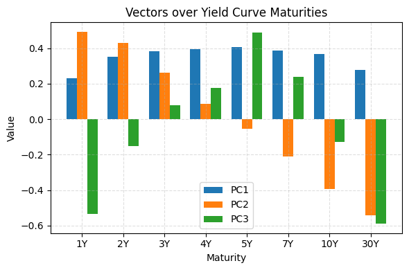
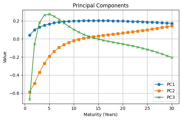
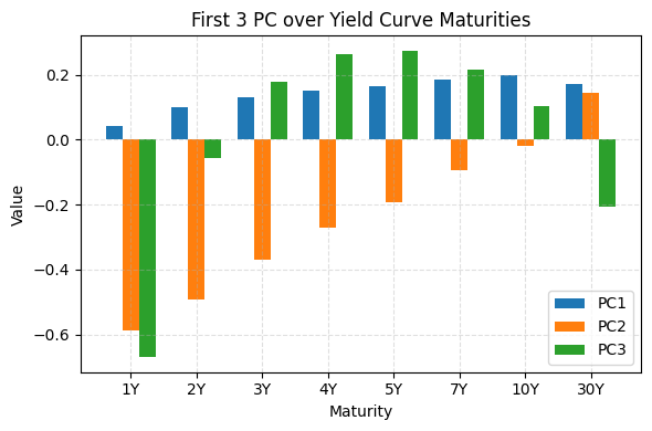
We can see that PC1 refers to the parallel shift component, with roughly identical loadings across different maturities.
This PC1 represents the idea that an increase in swap rate of any maturity will result in the upward shift of the swap curve, being an first-order approximation of the curve movement.
PC2 is the tilt component, representing a “flattening / deepening” of the curve. Short term moving up means long term rates going down, vice versa.
PC3 is the curvature component, represents the “convexity” of the curve. When one wants to trade the curvature/convexity of the curve, he hedges exposure to PC1 and PC2, and bet that short term and long term rates go up more than middle term rates
Fed Dataset yield curve#
We use the Fed dataset on yield curve
import pandas as pd

df = pd.read_csv('../data/PCA/feds200628.csv', skiprows=9)

# Convert the 'Date' column to datetime
df['Date'] = pd.to_datetime(df['Date'])

# want only year after 2023
df = df[df['Date'].dt.year >= 2023]

df.head()
| Date | BETA0 | BETA1 | BETA2 | BETA3 | SVEN1F01 | SVEN1F04 | SVEN1F09 | SVENF01 | SVENF02 | ... | SVENY23 | SVENY24 | SVENY25 | SVENY26 | SVENY27 | SVENY28 | SVENY29 | SVENY30 | TAU1 | TAU2 | |
|---|---|---|---|---|---|---|---|---|---|---|---|---|---|---|---|---|---|---|---|---|---|
| 16058 | 2023-01-02 | NaN | NaN | NaN | NaN | NaN | NaN | NaN | NaN | NaN | ... | NaN | NaN | NaN | NaN | NaN | NaN | NaN | NaN | NaN | NaN |
| 16059 | 2023-01-03 | 0.000043 | 5.031375 | -125.872907 | 131.460222 | 4.1544 | 3.5031 | 3.8863 | 4.3514 | 3.9039 | ... | 4.0440 | 4.0444 | 4.0408 | 4.0333 | 4.0221 | 4.0075 | 3.9895 | 3.9686 | 9.187250 | 9.787652 |
| 16060 | 2023-01-04 | 0.000090 | 5.042619 | -38.261344 | 43.868808 | 4.0843 | 3.3750 | 3.7794 | 4.3035 | 3.8171 | ... | 3.9626 | 3.9644 | 3.9622 | 3.9560 | 3.9460 | 3.9325 | 3.9157 | 3.8957 | 8.441780 | 10.344089 |
| 16061 | 2023-01-05 | 0.000091 | 5.102381 | -43.524776 | 48.945547 | 4.1513 | 3.4002 | 3.7260 | 4.3707 | 3.8797 | ... | 3.9385 | 3.9410 | 3.9397 | 3.9347 | 3.9262 | 3.9143 | 3.8992 | 3.8810 | 8.760276 | 10.464395 |
| 16062 | 2023-01-06 | 0.000017 | 5.135419 | -2.707217 | 11.546329 | 3.8941 | 3.1987 | 3.7278 | 4.1683 | 3.5968 | ... | 3.8233 | 3.8240 | 3.8215 | 3.8159 | 3.8075 | 3.7964 | 3.7829 | 3.7671 | 4.019105 | 15.718096 |
5 rows × 100 columns
Rates provided#
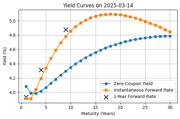
The FED provides those rates:
Zero-Coupon Yields (Continuously Compounded), up to 30Y maturity
Which we denote as \(R(T)\)
cols:SVENY01,SVENY02, …,SVENY30Instantaneous Forward Rates (Continuously Compounded), up to 30Y maturity
Which we denote as \(F(T)\) cols:SVENF01,SVENF02, …,SVENF30One-Year Forward Rates
cols:SVEN1F01,SVEN1F04,SVEN1F09
WhereF01= \(F(0, y_4, y_5)\) is the one year rate from Y4 to Y5
Recall that price of zero coupon bond:
For simplicity let \(t = 0, \tau = T-t = T\), we have
Recall that the instantaneous forward rate at future \(T: \)
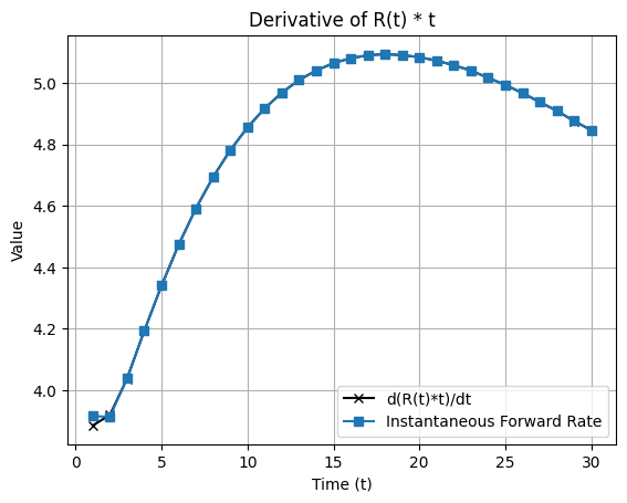
In other words, instantenous \(F\) is the gradient of the continuous yield for the period \((0, T)\), given by \(T \cdot R(0, T)\)
# Use today
latest = df[df['Date'] == df['Date'].max()]

years = list(range(1, 31)) # Maturities for 1 to 30 y

# Extract Zero-Coupon Yields R(t) (SVENYXX)
Rt_cols = [f'SVENY{str(y).zfill(2)}' for y in years]
Rt = latest[Rt_cols].values.flatten() # (30,) array

# Extract Instantaneous Forward Rates (SVENFXX)
Ft_cols = [f'SVENF{str(y).zfill(2)}' for y in years]
Ft = latest[Ft_cols].values.flatten()

# Extract One-Year Forward Rates (SVEN1FXX), if present
F1_cols = [col for col in latest.columns if col.startswith('SVEN1F')]
F1_maturities = [int(col[-2:]) for col in F1_cols]
F1_forward = latest[F1_cols].values.flatten()

plt.figure(figsize=(6,4))
plt.plot(years, Rt, label='Zero-Coupon Yield', marker='o')
plt.plot(years, Ft, label='Instantaneous Forward Rate', marker='s')
# plt.scatter(F1_maturities, F1_forward, label='1-Year Forward Rate')
plt.scatter(F1_maturities, F1_forward, label='1-Year Forward Rate', color='black', marker='x', s=100)

plt.title(f"Yield Curves on {latest['Date'].dt.date.values[0]}")
plt.xlabel("Maturity (Years)")
plt.ylabel("Yield (%)")
plt.grid(True)
plt.legend()
plt.tight_layout()
plt.show()
We check whether \(F(T)\) agrees with \(\frac{\partial}{\partial T} (T \cdot R(T))\), by interpolating \(R(t)\) and plotting here:
from scipy.interpolate import interp1d
from scipy.misc import derivative  # For numerical derivative

# Step 1: Define x (time) and y = R(t) * t
Rt_times_t = Rt * years

# Step 2: Interpolate R(t)*t
f_interp = interp1d(years, Rt_times_t, kind='cubic', fill_value='extrapolate')

# Step 3: Define derivative function
def d_Rt_t(t):
    return derivative(f_interp, t, dx=1e-6)

# Optional: compute derivative at all points
d_values = np.array([d_Rt_t(t) for t in years])

# Plot
plt.plot(years, d_values, label="d(R(t)*t)/dt", marker='x', color='black')
plt.plot(years, Ft, label='Instantaneous Forward Rate', marker='s')
plt.xlabel('Time (t)')
plt.ylabel('Value')
plt.legend()
plt.grid(True)
plt.title('Derivative of R(t) * t')
plt.show()
/var/folders/fd/vr4zygtx6jxftqb9dm5hvstw0000gn/T/ipykernel_81766/2092646037.py:12: DeprecationWarning: scipy.misc.derivative is deprecated in SciPy v1.10.0; and will be completely removed in SciPy v1.12.0. You may consider using findiff: https://github.com/maroba/findiff or numdifftools: https://github.com/pbrod/numdifftools
  return derivative(f_interp, t, dx=1e-6)
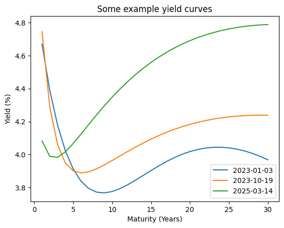
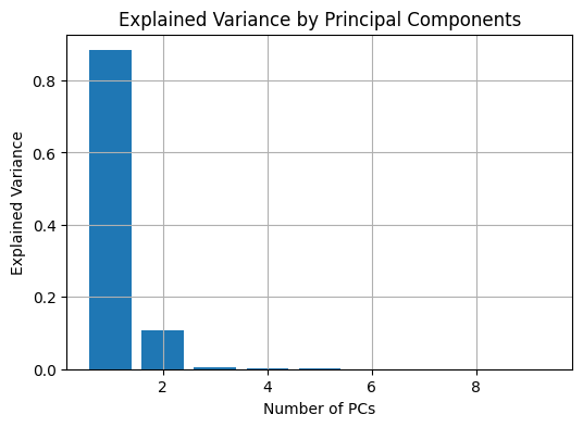
Now we perform PCA on the zero coupon yield \(R(T)\) ,using data from 2023 to 2025
years = list(range(1, 31)) # Maturities for 1 to 30 y

# Extract Zero-Coupon Yields R(t) (SVENYXX)
Rt_cols = [f'SVENY{str(y).zfill(2)}' for y in years]

# remove rows with NaN
df = df.dropna(subset=Rt_cols)
Rt = df[Rt_cols].values # (n, 30) np array

print('data shape', Rt.shape)

plt.plot(years, Rt[0], label=str(df['Date'].dt.date.values[0]))
plt.plot(years, Rt[250], label=str(df['Date'].dt.date.values[200]))
plt.plot(years, Rt[-1], label=str(df['Date'].dt.date.values[-1]))
plt.xlabel('Maturity (Years)')
plt.ylabel('Yield (%)')
plt.title('Some example yield curves')
plt.legend()
data shape (550, 30)
<matplotlib.legend.Legend at 0x174101610>
Rt_centered = Rt - Rt.mean(axis=0)

# SVD decomposition
U, S, Vt = np.linalg.svd(Rt_centered, full_matrices=False)

# Principal components (scores)
scores = U @ np.diag(S)

# Loadings (directions)
PC = Vt.T

# Explained variance
var_i = (S ** 2) / (Rt.shape[0] - 1)
var_i_ratio = var_i / var_i.sum()

plt.figure(figsize=(6, 4))
plt.bar(range(1, 10), var_i_ratio[:9])
plt.xlabel('Number of PCs')
plt.ylabel('Explained Variance')
plt.title('Explained Variance by Principal Components')
plt.grid(True)
plt.show()
# plot first 3 PCs
plt.figure(figsize=(6,4))
plt.plot(years, PC[:, 0], label='PC1', marker='o')
plt.plot(years, PC[:, 1], label='PC2', marker='s')
plt.plot(years, PC[:, 2], label='PC3', marker='x')
plt.xlabel('Maturity (Years)')
plt.ylabel('Value')
plt.title('Principal Components')
plt.legend()
plt.grid(True)
plt.tight_layout()
plt.show()
# Consider 8 maturities
maturities = ['1Y', '2Y', '3Y', '4Y', '5Y', '7Y', '10Y', '30Y']
T_indices = [0, 1, 2, 3, 4, 6, 9, 29]
x = np.arange(len(maturities))  # Positions
PC1 = PC[:, 0][T_indices]
PC2 = PC[:, 1][T_indices]
PC3 = PC[:, 2][T_indices]


plt.figure(figsize=(6, 4))
bar_width = 0.25

plt.bar(x - bar_width, PC1, width=bar_width, label='PC1')
plt.bar(x, PC2, width=bar_width, label='PC2')
plt.bar(x + bar_width, PC3, width=bar_width, label='PC3')

plt.xticks(x, maturities)
plt.xlabel('Maturity')
plt.ylabel('Value')
plt.title('First 3 PC over Yield Curve Maturities')
plt.legend()
plt.grid(True, linestyle='--', alpha=0.4)
plt.tight_layout()
plt.show()
Example RV strategy using PCA#
Given PCA, we may want a portfolio that is immune to changes in PC1 and PC2, but only reflecting PC3. i.e. We want to hedge our delta (DV01) exposure to parallel up/down movements of rates and steepening/flattening of the curve, and only trade convexity.
We construct our portflio with \(\sum w_i B_i\), where \(\{B_i\}_{i=1}^{30}\) represent bonds of maturities from 1Y to 30Y, and \(w_i\) is portfolio weights
Let the delta (DV01, how much asset moves w.r.t. 1bps change) of each \(B_i\) be \(\delta_i\).
(note: long position means negative delta, as rate increase means bond drop)
Hedging PC1#
Our total delta is \(w \cdot \delta\). To hedge against PC1, we need \(w \cdot \delta = 0\)
Hedging PC2#
We group portfolio into buckets. E.g. compute total delta for short end (0-2Y): \(\delta_s = \delta_{0:2} = \sum_{i=0}^2 \delta_i\), mid-term (2Y-7Y) \(\delta_m = \delta_{2:7}\), long-term \(\delta_l\)
Then to be flat on a steepner/flattener, we hedge \(\delta_l = \delta_s\)
Trading PC3#
perfect hedging is not possible, but by construction, PC3 is independent with PC1 and PC2, so simply taking \(w \cdot \delta = PC3\) allows us to trade convexity, and in theory be flat to movements in PC1 and PC2.
(E.g. our delta position in 1Y bond is given by \(w_1 \cdot \delta_1\), which we want to set equal to PC3[0], and so on)
following the plot, we can long 1Y and 30Y (short delta), and short the mid-terms (long delta), so that we are long convexity. The other direction is vice versa
